


The Medieval Times website was fraught with usability issues. It was exceedingly difficult to purchase tickets for the dinner and tournament. Each of the eleven castle's individual websites contained 98% identical content, which was hurting their SEO. The site contained some great photography of the show itself, but the experience was impersonal, unapproachable, and at times just frustrating. I created a strategy to address these main issues and turn a site that was failing the company into a true digital asset.
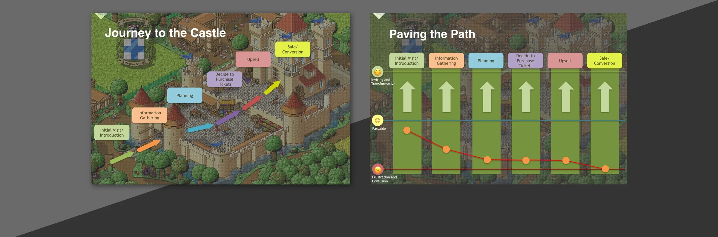
I approached this project by first considering the ideal customer journey. I mapped this path "to the castle" to help the client visualize the customer journey. At every touchpoint the road should be smoothly paved and easy for the customer to get through, encouraging the customer to continue to the ultimate goal. This strategy not only served to inspire the website, but also the entire offline sales process.
Medieval Times is all about action! I wanted the first thing a visitor sees to be a huge, impactful moment. We accomplished this by shooting a video filled with action moments and presenting it full-screen on site load. Right away, the visitor can begin to get excited about what awaits them at the castle! Interactive menus below serve as a wayfinding area.
The old site map included eleven local sites all with duplicate content about the show. This structure presented an SEO problem due to Google’s Panda Update penalizing duplicate content. The architecture also presented a barrier to users wanting to buy tickets because it required that they select their nearest castle first. I proposed simplifying the IA and using data modeling and geo-targeting to change the content of the site itself based on the visitor’s IP location. This makes choosing a castle unnecessary, making buying tickets as seamless as possible. The drastically improved site architecture makes the site clean and tidy for SEO.
The existing main navigation was overly complex. I conducted card sorting research to inform the new information architecture. This was immensely helpful in both developing the completely new site map and presenting it to the client. The main navigation has been narrowed down to three main items with a clear call to action to get tickets.
To address the myriad of usability issues, I presented a deck that illustrated some difficult areas (unpaved, rocky paths) along the customer journey. I used Steve Krugg's classic "Don't Make Me Think" methodology to explain to the client how I planned to clean up these areas and make them smooth and easy to get through.
The initial photo library the client gave us access to had amazing photos of the show itself. However there was something missing. We needed to turn the camera around and capture authentic audience moments to show people how and why they should go to Medieval Times. This type of imagery is also powerful at overcoming a main perception challenge that Medieval Times is "nerdy." It demonstrates that Medieval Times is for everyone.