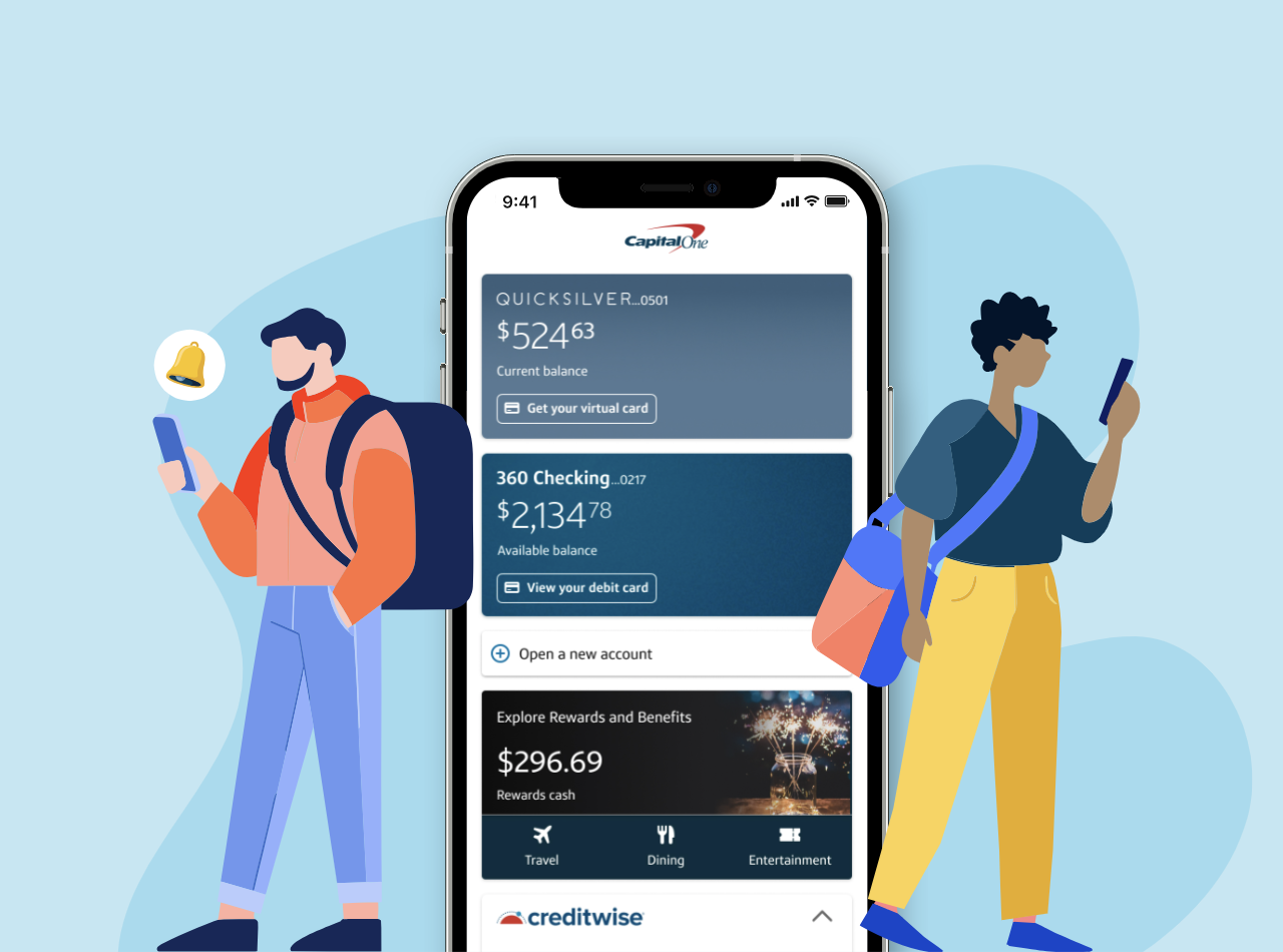


As part of a special design cohort at Capital One, I contributed to the evolution of the Virtual Wallet feature on the company’s flagship mobile app, used daily by millions of customers.
The challenge was clear: customers wanted more detail about their cards and available key actions directly on the main screen, but adding more data risked cluttering the interface and compromising usability.
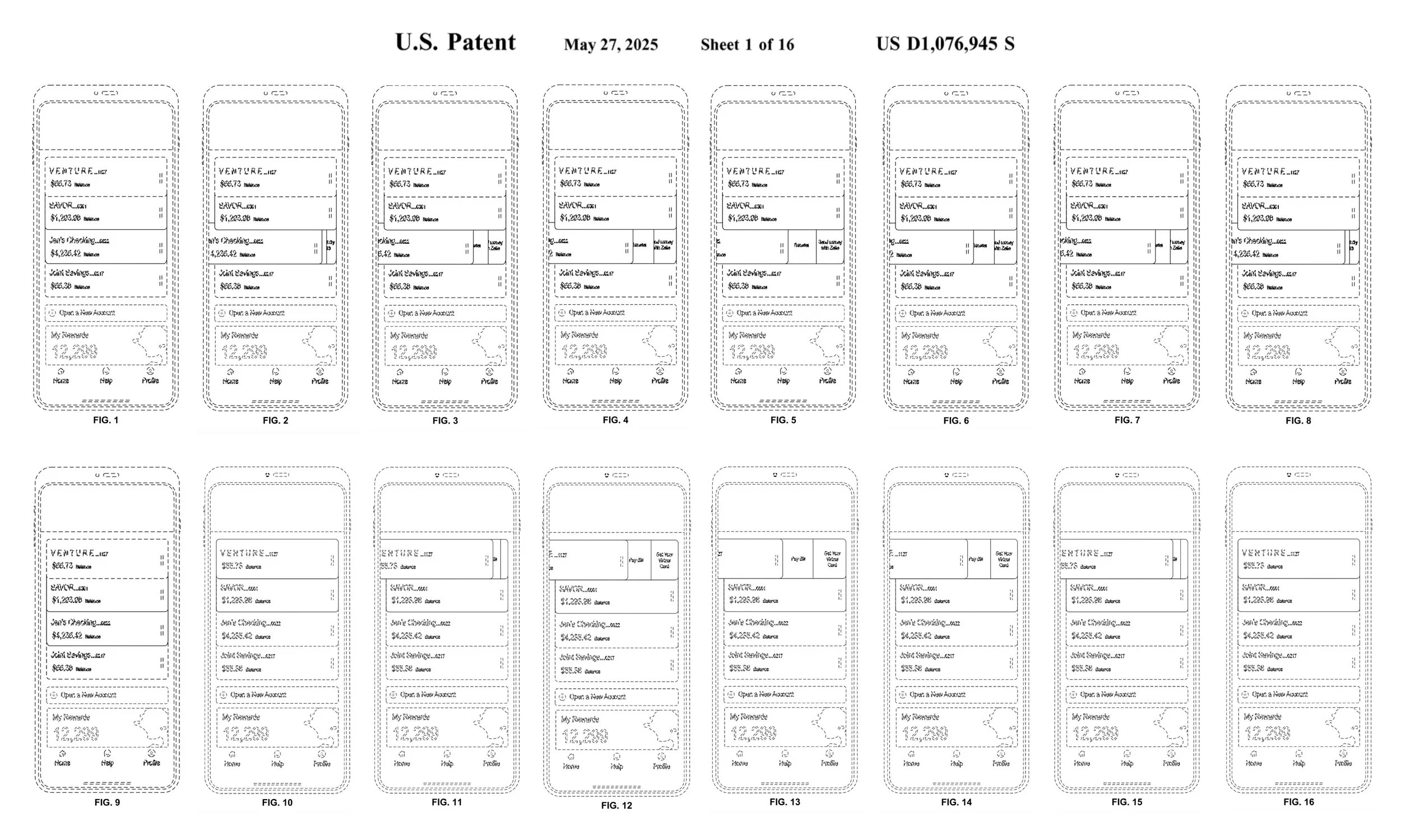
My solution successfully introduced additional layers of information while preserving the app’s hallmark simplicity. This design not only enhanced the user experience but was also recognized as innovative enough to secure Patent No. US D1.076.945 S. (Display Screen With an Animated Graphical User Interface), on which I am a named inventor.
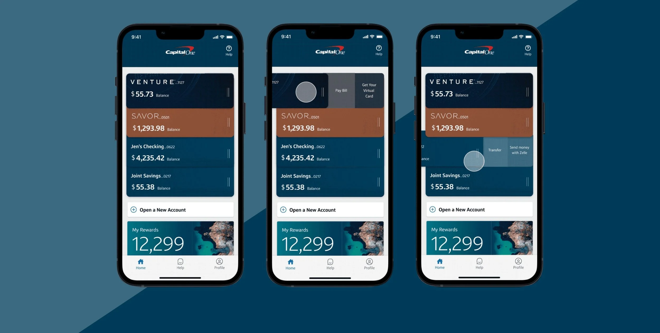
The main wallet screen served as the first touchpoint for many users engaging with their accounts. Feedback indicated that customers wanted quick access to more details about their cards (balances, transactions, and features), and a way to view this data quickly without digging deeper into multiple screens.
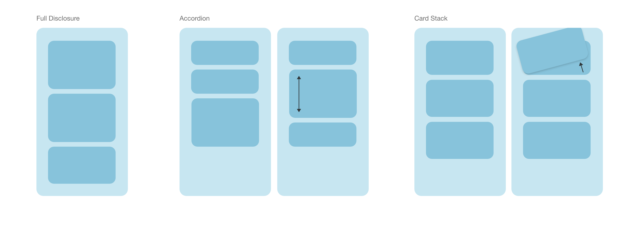
The design team faced a tension between information density and visual clarity. Adding more details risked creating cognitive overload, but withholding data created friction for users who needed quick access to their information.
To address the challenge, I created an initial user test to understand what information was most useful to users. I created low-fidelity prototypes to quickly explore animation and interaction patterns that could reveal more data progressively without overwhelming the default view.
I was inspired by the idea of physical cards and how they might behave in a physical wallet. I then created high-quality prototypes to share with pilot users and gather feedback on usability. The main challenge was making sure users understood that the cards could be swiped to the left. I ensured this by testing multiple prototypes with different interactive affordances.
Instead of static clutter, the final design leveraged skeuomorphism and natural hand gestures in an innovative microinteraction that reveals details only when needed.
This solution allowed customers to access richer data instantly, while ensuring the main wallet screen remained uncluttered. The interaction felt natural, lightweight, and intuitive, reducing friction while increasing user value.